Getting started
An overview of Bootstrap, how to download and use, basic templates and examples, and more.
An overview of Bootstrap, how to download and use, basic templates and examples, and more.
Bootstrap (currently v3.4.1) has a few easy ways to quickly get started, each one appealing to a different skill level and use case. Read through to see what suits your particular needs.
Compiled and minified CSS, JavaScript, and fonts. No docs or original source files are included.
Source Less, JavaScript, and font files, along with our docs. Requires a Less compiler and some setup.
Bootstrap ported from Less to Sass for easy inclusion in Rails, Compass, or Sass-only projects.
The folks over at StackPath graciously provide CDN support for Bootstrap's CSS and JavaScript. Just use these BootstrapCDN links.
<!-- Latest compiled and minified CSS -->
<link rel="stylesheet" href="https://stackpath.bootstrapcdn.com/bootstrap/3.4.1/css/bootstrap.min.css" integrity="sha384-HSMxcRTRxnN+Bdg0JdbxYKrThecOKuH5zCYotlSAcp1+c8xmyTe9GYg1l9a69psu" crossorigin="anonymous">

<!-- Optional theme -->
<link rel="stylesheet" href="https://stackpath.bootstrapcdn.com/bootstrap/3.4.1/css/bootstrap-theme.min.css" integrity="sha384-6pzBo3FDv/PJ8r2KRkGHifhEocL+1X2rVCTTkUfGk7/0pbek5mMa1upzvWbrUbOZ" crossorigin="anonymous">

<!-- Latest compiled and minified JavaScript -->
<script src="https://stackpath.bootstrapcdn.com/bootstrap/3.4.1/js/bootstrap.min.js" integrity="sha384-aJ21OjlMXNL5UyIl/XNwTMqvzeRMZH2w8c5cRVpzpU8Y5bApTppSuUkhZXN0VxHd" crossorigin="anonymous"></script>You can also install and manage Bootstrap's Less, CSS, JavaScript, and fonts using Bower:
bower install bootstrapYou can also install Bootstrap using npm:
npm install bootstrap@3require('bootstrap') will load all of Bootstrap's jQuery plugins onto the jQuery object. The bootstrap module itself does not export anything. You can manually load Bootstrap's jQuery plugins individually by loading the /js/*.js files under the package's top-level directory.
Bootstrap's package.json contains some additional metadata under the following keys:
less - path to Bootstrap's main Less source filestyle - path to Bootstrap's non-minified CSS that's been precompiled using the default settings (no customization)You can also install and manage Bootstrap's Less, CSS, JavaScript, and fonts using Composer:
composer require twbs/bootstrapBootstrap uses Autoprefixer to deal with CSS vendor prefixes. If you're compiling Bootstrap from its Less/Sass source and not using our Gruntfile, you'll need to integrate Autoprefixer into your build process yourself. If you're using precompiled Bootstrap or using our Gruntfile, you don't need to worry about this because Autoprefixer is already integrated into our Gruntfile.
Bootstrap is downloadable in two forms, within which you'll find the following directories and files, logically grouping common resources and providing both compiled and minified variations.
Please note that all JavaScript plugins require jQuery to be included, as shown in the starter template. Consult our bower.json to see which versions of jQuery are supported.
Once downloaded, unzip the compressed folder to see the structure of (the compiled) Bootstrap. You'll see something like this:
bootstrap/
├── css/
│   ├── bootstrap.css
│   ├── bootstrap.css.map
│   ├── bootstrap.min.css
│   ├── bootstrap.min.css.map
│   ├── bootstrap-theme.css
│   ├── bootstrap-theme.css.map
│   ├── bootstrap-theme.min.css
│   └── bootstrap-theme.min.css.map
├── js/
│   ├── bootstrap.js
│   └── bootstrap.min.js
└── fonts/
    ├── glyphicons-halflings-regular.eot
    ├── glyphicons-halflings-regular.svg
    ├── glyphicons-halflings-regular.ttf
    ├── glyphicons-halflings-regular.woff
    └── glyphicons-halflings-regular.woff2
This is the most basic form of Bootstrap: precompiled files for quick drop-in usage in nearly any web project. We provide compiled CSS and JS (bootstrap.*), as well as compiled and minified CSS and JS (bootstrap.min.*). CSS source maps (bootstrap.*.map) are available for use with certain browsers' developer tools. Fonts from Glyphicons are included, as is the optional Bootstrap theme.
The Bootstrap source code download includes the precompiled CSS, JavaScript, and font assets, along with source Less, JavaScript, and documentation. More specifically, it includes the following and more:
bootstrap/
├── less/
├── js/
├── fonts/
├── dist/
│   ├── css/
│   ├── js/
│   └── fonts/
└── docs/
    └── examples/
The less/, js/, and fonts/ are the source code for our CSS, JS, and icon fonts (respectively). The dist/ folder includes everything listed in the precompiled download section above. The docs/ folder includes the source code for our documentation, and examples/ of Bootstrap usage. Beyond that, any other included file provides support for packages, license information, and development.
Bootstrap uses Grunt for its build system, with convenient methods for working with the framework. It's how we compile our code, run tests, and more.
To install Grunt, you must first download and install node.js (which includes npm). npm stands for node packaged modules and is a way to manage development dependencies through node.js.
Then, from the command line:grunt-cli globally with npm install -g grunt-cli./bootstrap/ directory, then run npm install. npm will look at the package.json file and automatically install the necessary local dependencies listed there.When completed, you'll be able to run the various Grunt commands provided from the command line.
grunt dist (Just compile CSS and JavaScript)Regenerates the /dist/ directory with compiled and minified CSS and JavaScript files. As a Bootstrap user, this is normally the command you want.
grunt watch (Watch)Watches the Less source files and automatically recompiles them to CSS whenever you save a change.
grunt test (Run tests)Runs JSHint and runs the QUnit tests in real browsers thanks to Karma.
grunt docs (Build & test the docs assets)Builds and tests CSS, JavaScript, and other assets which are used when running the documentation locally via bundle exec jekyll serve.
grunt (Build absolutely everything and run tests)Compiles and minifies CSS and JavaScript, builds the documentation website, runs the HTML5 validator against the docs, regenerates the Customizer assets, and more. Requires Jekyll. Usually only necessary if you're hacking on Bootstrap itself.
Should you encounter problems with installing dependencies or running Grunt commands, first delete the /node_modules/ directory generated by npm. Then, rerun npm install.
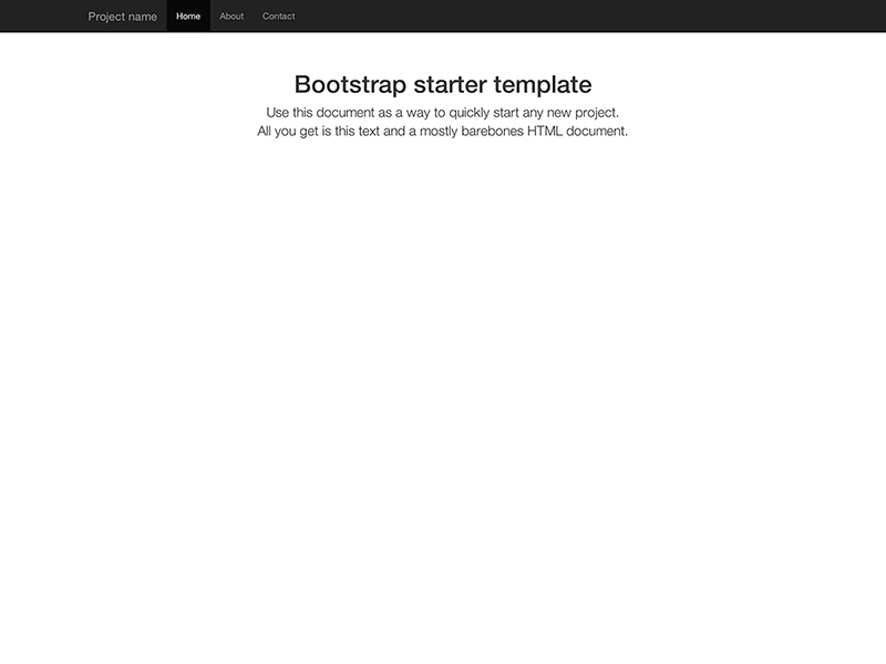
Start with this basic HTML template, or modify these examples. We hope you'll customize our templates and examples, adapting them to suit your needs.
Copy the HTML below to begin working with a minimal Bootstrap document.
<!doctype html>
<html lang="en">
  <head>
    <meta charset="utf-8">
    <meta http-equiv="X-UA-Compatible" content="IE=edge">
    <meta name="viewport" content="width=device-width, initial-scale=1">
    <!-- The above 3 meta tags *must* come first in the head; any other head content must come *after* these tags -->
    <title>Bootstrap 101 Template</title>

    <!-- Bootstrap -->
    <link rel="stylesheet" href="https://stackpath.bootstrapcdn.com/bootstrap/3.4.1/css/bootstrap.min.css" integrity="sha384-HSMxcRTRxnN+Bdg0JdbxYKrThecOKuH5zCYotlSAcp1+c8xmyTe9GYg1l9a69psu" crossorigin="anonymous">

    <!-- HTML5 shim and Respond.js for IE8 support of HTML5 elements and media queries -->
    <!-- WARNING: Respond.js doesn't work if you view the page via file:// -->
    <!--[if lt IE 9]>
      <script src="https://oss.maxcdn.com/html5shiv/3.7.3/html5shiv.min.js"></script>
      <script src="https://oss.maxcdn.com/respond/1.4.2/respond.min.js"></script>
    <![endif]-->
  </head>
  <body>
    <h1>Hello, world!</h1>

    <!-- jQuery (necessary for Bootstrap's JavaScript plugins) -->
    <script src="https://code.jquery.com/jquery-1.12.4.min.js" integrity="sha384-nvAa0+6Qg9clwYCGGPpDQLVpLNn0fRaROjHqs13t4Ggj3Ez50XnGQqc/r8MhnRDZ" crossorigin="anonymous"></script>
    <!-- Include all compiled plugins (below), or include individual files as needed -->
    <script src="https://stackpath.bootstrapcdn.com/bootstrap/3.4.1/js/bootstrap.min.js" integrity="sha384-aJ21OjlMXNL5UyIl/XNwTMqvzeRMZH2w8c5cRVpzpU8Y5bApTppSuUkhZXN0VxHd" crossorigin="anonymous"></script>
  </body>
</html>Build on the basic template above with Bootstrap's many components. We encourage you to customize and adapt Bootstrap to suit your individual project's needs.
Get the source code for every example below by downloading the Bootstrap repository. Examples can be found in the docs/examples/ directory.
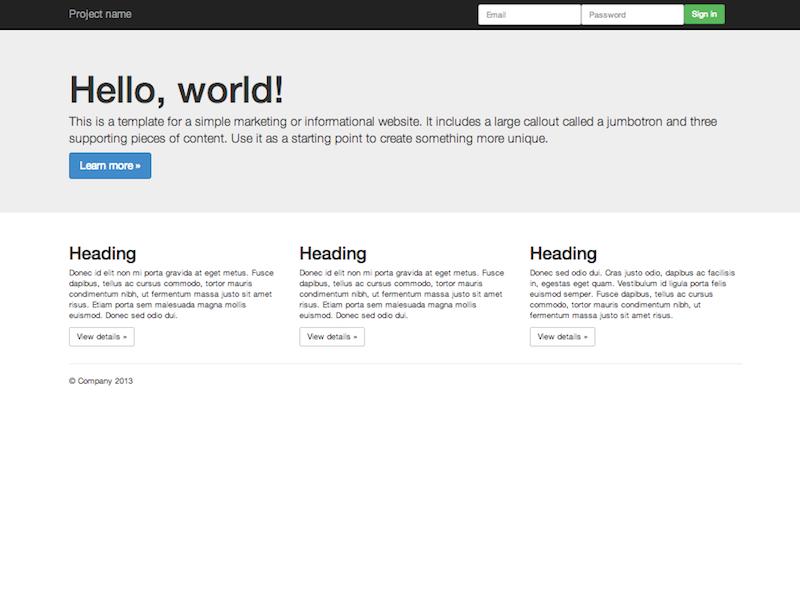
Nothing but the basics: compiled CSS and JavaScript along with a container.
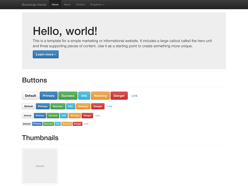
Load the optional Bootstrap theme for a visually enhanced experience.
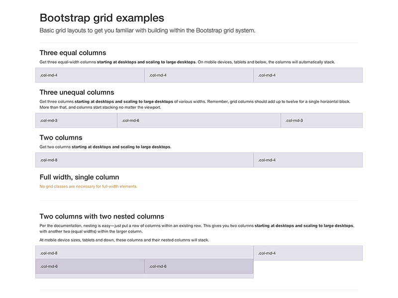
Multiple examples of grid layouts with all four tiers, nesting, and more.
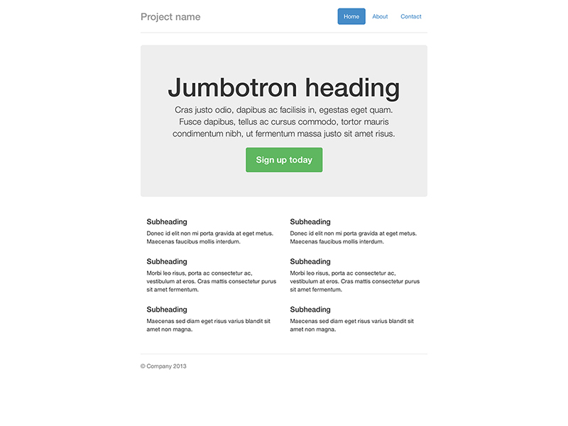
Build around the jumbotron with a navbar and some basic grid columns.
Build a more custom page by narrowing the default container and jumbotron.
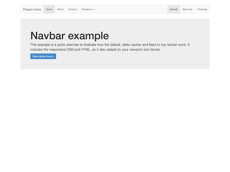
Super basic template that includes the navbar along with some additional content.
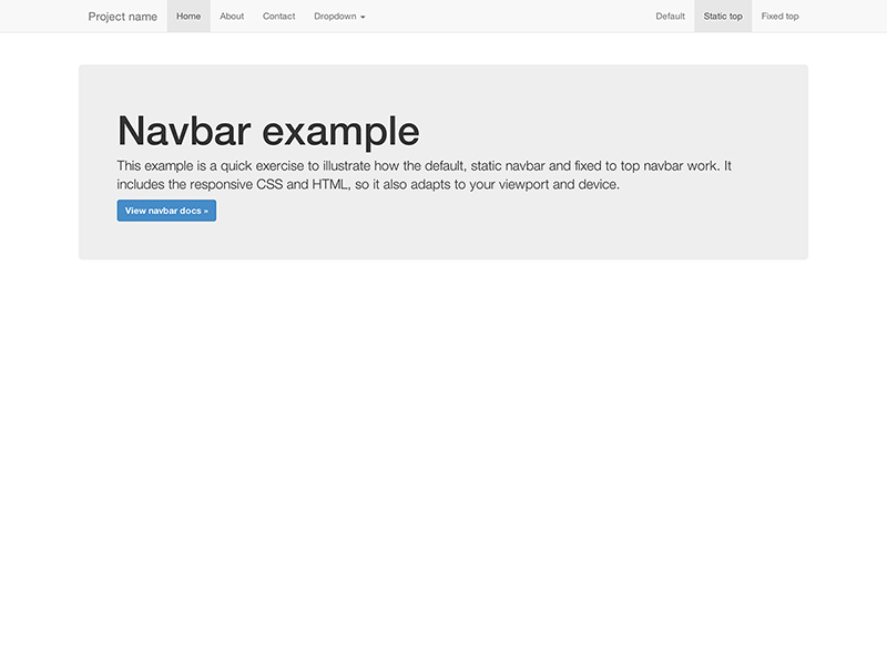
Super basic template with a static top navbar along with some additional content.
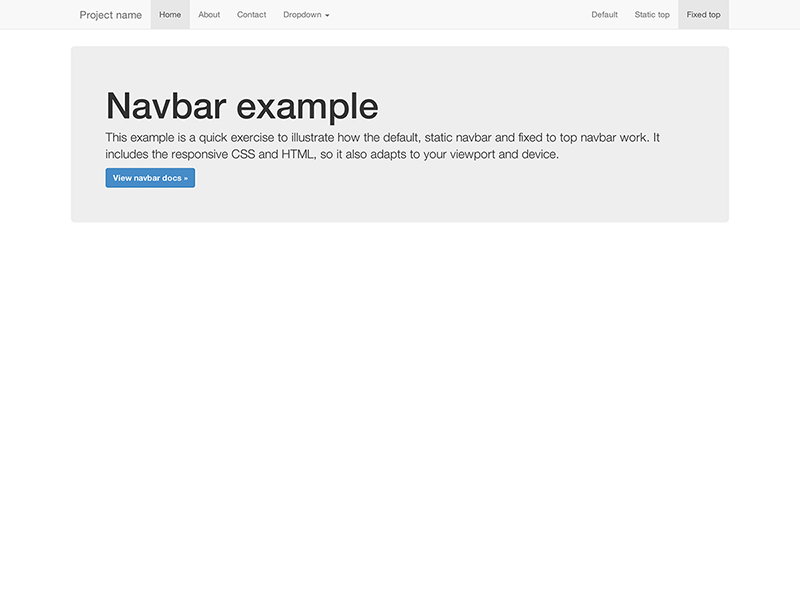
Super basic template with a fixed top navbar along with some additional content.
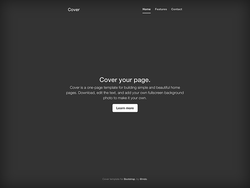
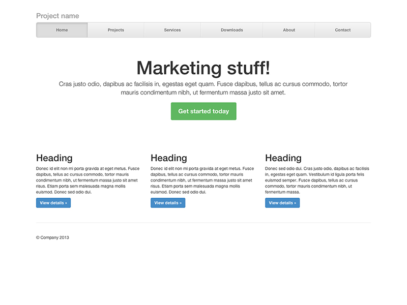
A one-page template for building simple and beautiful home pages.
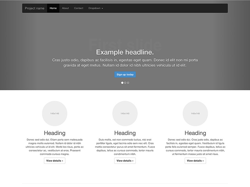
Customize the navbar and carousel, then add some new components.
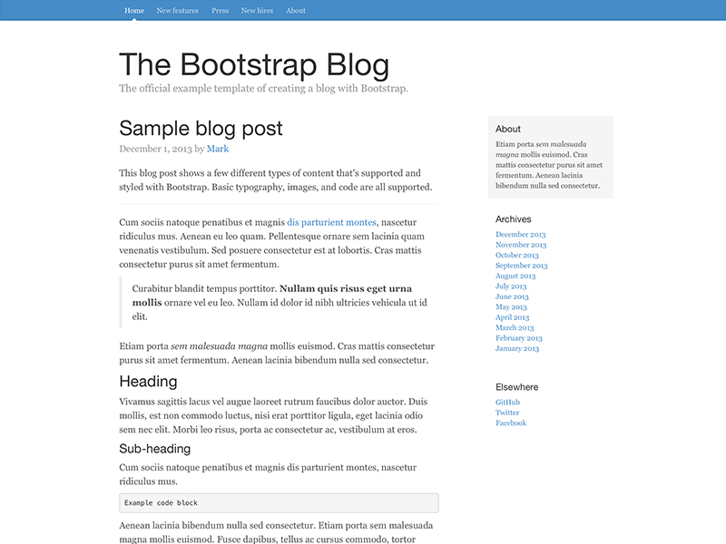
Simple two-column blog layout with custom navigation, header, and type.
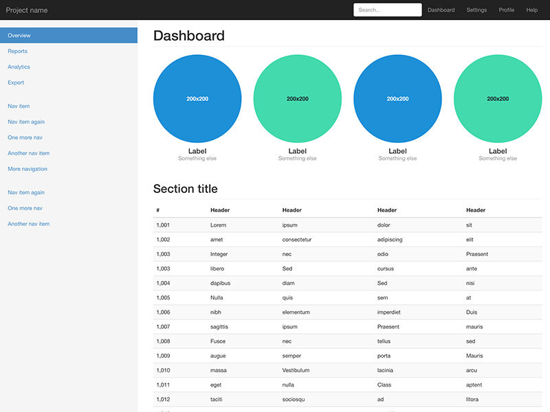
Basic structure for an admin dashboard with fixed sidebar and navbar.
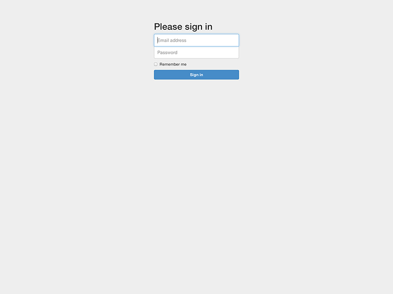
Custom form layout and design for a simple sign in form.
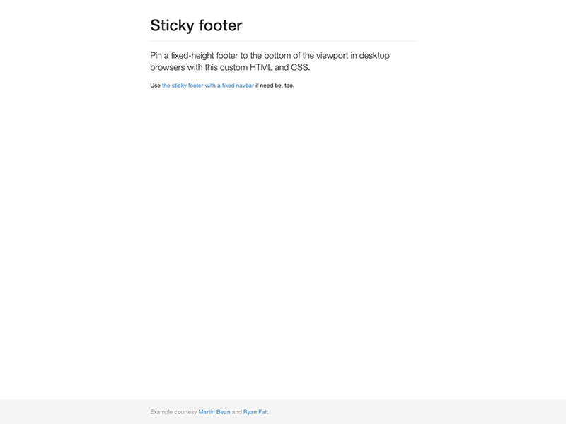
Attach a footer to the bottom of the viewport when the content is shorter than it.
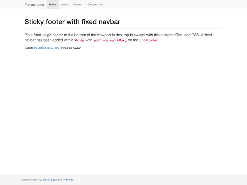
Attach a footer to the bottom of the viewport with a fixed navbar at the top.
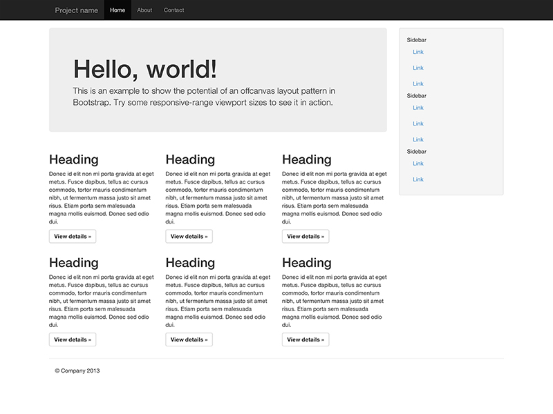
Build a toggleable off-canvas navigation menu for use with Bootstrap.
Bootlint is the official Bootstrap HTML linter tool. It automatically checks for several common HTML mistakes in webpages that are using Bootstrap in a fairly "vanilla" way. Vanilla Bootstrap's components/widgets require their parts of the DOM to conform to certain structures. Bootlint checks that instances of Bootstrap components have correctly-structured HTML. Consider adding Bootlint to your Bootstrap web development toolchain so that none of the common mistakes slow down your project's development.
Stay up to date on the development of Bootstrap and reach out to the community with these helpful resources.
irc.freenode.net server, in the ##bootstrap channel.twitter-bootstrap-3.bootstrap on packages which modify or add to the functionality of Bootstrap when distributing through npm or similar delivery mechanisms for maximum discoverability.You can also follow @getbootstrap on Twitter for the latest gossip and awesome music videos.
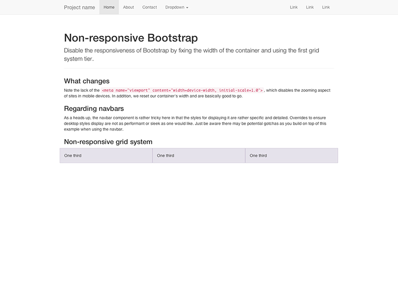
Bootstrap automatically adapts your pages for various screen sizes. Here's how to disable this feature so your page works like this non-responsive example.
<meta> mentioned in the CSS docswidth on the .container for each grid tier with a single width, for example width: 970px !important; Be sure that this comes after the default Bootstrap CSS. You can optionally avoid the !important with media queries or some selector-fu..col-xs-* classes in addition to, or in place of, the medium/large ones. Don't worry, the extra-small device grid scales to all resolutions.You'll still need Respond.js for IE8 (since our media queries are still there and need to be processed). This disables the "mobile site" aspects of Bootstrap.
We've applied these steps to an example. Read its source code to see the specific changes implemented.
Looking to migrate from an older version of Bootstrap to v3.x? Check out our migration guide.
Bootstrap is built to work best in the latest desktop and mobile browsers, meaning older browsers might display differently styled, though fully functional, renderings of certain components.
Specifically, we support the latest versions of the following browsers and platforms.
Alternative browsers which use the latest version of WebKit, Blink, or Gecko, whether directly or via the platform's web view API, are not explicitly supported. However, Bootstrap should (in most cases) display and function correctly in these browsers as well. More specific support information is provided below.
Generally speaking, Bootstrap supports the latest versions of each major platform's default browsers. Note that proxy browsers (such as Opera Mini, Opera Mobile's Turbo mode, UC Browser Mini, Amazon Silk) are not supported.
| Chrome | Firefox | Safari | |
|---|---|---|---|
| Android | Supported | Supported | N/A |
| iOS | Supported | Supported | Supported |
Similarly, the latest versions of most desktop browsers are supported.
| Chrome | Firefox | Internet Explorer | Opera | Safari | |
|---|---|---|---|---|---|
| Mac | Supported | Supported | N/A | Supported | Supported |
| Windows | Supported | Supported | Supported | Supported | Not supported |
On Windows, we support Internet Explorer 8-11.
For Firefox, in addition to the latest normal stable release, we also support the latest Extended Support Release (ESR) version of Firefox.
Unofficially, Bootstrap should look and behave well enough in Chromium and Chrome for Linux, Firefox for Linux, and Internet Explorer 7, as well as Microsoft Edge, though they are not officially supported.
For a list of some of the browser bugs that Bootstrap has to grapple with, see our Wall of browser bugs.
Internet Explorer 8 and 9 are also supported, however, please be aware that some CSS3 properties and HTML5 elements are not fully supported by these browsers. In addition, Internet Explorer 8 requires the use of Respond.js to enable media query support.
| Feature | Internet Explorer 8 | Internet Explorer 9 |
|---|---|---|
border-radius |
Not supported | Supported |
box-shadow |
Not supported | Supported |
transform |
Not supported | Supported, with -ms prefix |
transition |
Not supported | |
placeholder |
Not supported | |
Visit Can I use... for details on browser support of CSS3 and HTML5 features.
Beware of the following caveats when using Respond.js in your development and production environments for Internet Explorer 8.
Using Respond.js with CSS hosted on a different (sub)domain (for example, on a CDN) requires some additional setup. See the Respond.js docs for details.
file://Due to browser security rules, Respond.js doesn't work with pages viewed via the file:// protocol (like when opening a local HTML file). To test responsive features in IE8, view your pages over HTTP(S). See the Respond.js docs for details.
@importRespond.js doesn't work with CSS that's referenced via @import. In particular, some Drupal configurations are known to use @import. See the Respond.js docs for details.
IE8 does not fully support box-sizing: border-box; when combined with min-width, max-width, min-height, or max-height. For that reason, as of v3.0.1, we no longer use max-width on .containers.
IE8 has some issues with @font-face when combined with :before. Bootstrap uses that combination with its Glyphicons. If a page is cached, and loaded without the mouse over the window (i.e. hit the refresh button or load something in an iframe) then the page gets rendered before the font loads. Hovering over the page (body) will show some of the icons and hovering over the remaining icons will show those as well. See issue #13863 for details.
Bootstrap is not supported in the old Internet Explorer compatibility modes. To be sure you're using the latest rendering mode for IE, consider including the appropriate <meta> tag in your pages:
<meta http-equiv="X-UA-Compatible" content="IE=edge">Confirm the document mode by opening the debugging tools: press F12 and check the "Document Mode".
This tag is included in all of Bootstrap's documentation and examples to ensure the best rendering possible in each supported version of Internet Explorer.
See this StackOverflow question for more information.
Internet Explorer 10 doesn't differentiate device width from viewport width, and thus doesn't properly apply the media queries in Bootstrap's CSS. Normally you'd just add a quick snippet of CSS to fix this:
@-ms-viewport { width: device-width; }However, this doesn't work for devices running Windows Phone 8 versions older than Update 3 (a.k.a. GDR3), as it causes such devices to show a mostly desktop view instead of narrow "phone" view. To address this, you'll need to include the following CSS and JavaScript to work around the bug.
@-ms-viewport       { width: device-width; }
@-o-viewport        { width: device-width; }
@viewport           { width: device-width; }
// Copyright 2014-2019 Twitter, Inc.
// Licensed under MIT (https://github.com/twbs/bootstrap/blob/master/LICENSE)
if (navigator.userAgent.match(/IEMobile\/10\.0/)) {
var msViewportStyle = document.createElement('style')
msViewportStyle.appendChild(
document.createTextNode(
'@-ms-viewport{width:auto!important}'
)
)
document.querySelector('head').appendChild(msViewportStyle)
}For more information and usage guidelines, read Windows Phone 8 and Device-Width.
As a heads up, we include this in all of Bootstrap's documentation and examples as a demonstration.
The rendering engine of versions of Safari prior to v7.1 for OS X and Safari for iOS v8.0 had some trouble with the number of decimal places used in our .col-*-1 grid classes. So if you had 12 individual grid columns, you'd notice that they came up short compared to other rows of columns. Besides upgrading Safari/iOS, you have some options for workarounds:
.pull-right to your last grid column to get the hard-right alignmentSupport for overflow: hidden on the <body> element is quite limited in iOS and Android. To that end, when you scroll past the top or bottom of a modal in either of those devices' browsers, the <body> content will begin to scroll. See Chrome bug #175502 (fixed in Chrome v40) and WebKit bug #153852.
As of iOS 9.3, while a modal is open, if the initial touch of a scroll gesture is within the boundary of a textual <input> or a <textarea>, the <body> content underneath the modal will be scrolled instead of the modal itself. See WebKit bug #153856.
Also, note that if you're using a fixed navbar or using inputs within a modal, iOS has a rendering bug that doesn't update the position of fixed elements when the virtual keyboard is triggered. A few workarounds for this include transforming your elements to position: absolute or invoking a timer on focus to try to correct the positioning manually. This is not handled by Bootstrap, so it is up to you to decide which solution is best for your application.
The .dropdown-backdrop element isn't used on iOS in the nav because of the complexity of z-indexing. Thus, to close dropdowns in navbars, you must directly click the dropdown element (or any other element which will fire a click event in iOS).
Page zooming inevitably presents rendering artifacts in some components, both in Bootstrap and the rest of the web. Depending on the issue, we may be able to fix it (search first and then open an issue if need be). However, we tend to ignore these as they often have no direct solution other than hacky workarounds.
:hover/:focus on mobileEven though real hovering isn't possible on most touchscreens, most mobile browsers emulate hovering support and make :hover "sticky". In other words, :hover styles start applying after tapping an element and only stop applying after the user taps some other element. This can cause Bootstrap's :hover states to become undesirably "stuck" on such browsers. Some mobile browsers also make :focus similarly sticky. There is currently no simple workaround for these issues other than removing such styles entirely.
Even in some modern browsers, printing can be quirky.
In particular, as of Chrome v32 and regardless of margin settings, Chrome uses a viewport width significantly narrower than the physical paper size when resolving media queries while printing a webpage. This can result in Bootstrap's extra-small grid being unexpectedly activated when printing. See issue #12078 and Chrome bug #273306 for some details. Suggested workarounds:
@screen-* Less variables so that your printer paper is considered larger than extra-small.Also, as of Safari v8.0, fixed-width .containers can cause Safari to use an unusually small font size when printing. See #14868 and WebKit bug #138192 for more details. One potential workaround for this is adding the following CSS:
@media print {
  .container {
    width: auto;
  }
}Out of the box, Android 4.1 (and even some newer releases apparently) ship with the Browser app as the default web browser of choice (as opposed to Chrome). Unfortunately, the Browser app has lots of bugs and inconsistencies with CSS in general.
On <select> elements, the Android stock browser will not display the side controls if there is a border-radius and/or border applied. (See this StackOverflow question for details.) Use the snippet of code below to remove the offending CSS and render the <select> as an unstyled element on the Android stock browser. The user agent sniffing avoids interference with Chrome, Safari, and Mozilla browsers.
<script>
$(function () {
  var nua = navigator.userAgent
  var isAndroid = (nua.indexOf('Mozilla/5.0') > -1 && nua.indexOf('Android ') > -1 && nua.indexOf('AppleWebKit') > -1 && nua.indexOf('Chrome') === -1)
  if (isAndroid) {
    $('select.form-control').removeClass('form-control').css('width', '100%')
  }
})
</script>
Want to see an example? Check out this JS Bin demo.
In order to provide the best possible experience to old and buggy browsers, Bootstrap uses CSS browser hacks in several places to target special CSS to certain browser versions in order to work around bugs in the browsers themselves. These hacks understandably cause CSS validators to complain that they are invalid. In a couple places, we also use bleeding-edge CSS features that aren't yet fully standardized, but these are used purely for progressive enhancement.
These validation warnings don't matter in practice since the non-hacky portion of our CSS does fully validate and the hacky portions don't interfere with the proper functioning of the non-hacky portion, hence why we deliberately ignore these particular warnings.
Our HTML docs likewise have some trivial and inconsequential HTML validation warnings due to our inclusion of a workaround for a certain Firefox bug.
While we don't officially support any third party plugins or add-ons, we do offer some useful advice to help avoid potential issues in your projects.
Some third party software, including Google Maps and Google Custom Search Engine, conflict with Bootstrap due to * { box-sizing: border-box; }, a rule which makes it so padding does not affect the final computed width of an element. Learn more about box model and sizing at CSS Tricks.
Depending on the context, you may override as-needed (Option 1) or reset the box-sizing for entire regions (Option 2).
/* Box-sizing resets
 *
 * Reset individual elements or override regions to avoid conflicts due to
 * global box model settings of Bootstrap. Two options, individual overrides and
 * region resets, are available as plain CSS and uncompiled Less formats.
 */

/* Option 1A: Override a single element's box model via CSS */
.element {
  -webkit-box-sizing: content-box;
     -moz-box-sizing: content-box;
          box-sizing: content-box;
}

/* Option 1B: Override a single element's box model by using a Bootstrap Less mixin */
.element {
  .box-sizing(content-box);
}

/* Option 2A: Reset an entire region via CSS */
.reset-box-sizing,
.reset-box-sizing *,
.reset-box-sizing *:before,
.reset-box-sizing *:after {
  -webkit-box-sizing: content-box;
     -moz-box-sizing: content-box;
          box-sizing: content-box;
}

/* Option 2B: Reset an entire region with a custom Less mixin */
.reset-box-sizing {
  &,
  *,
  *:before,
  *:after {
    .box-sizing(content-box);
  }
}
.element {
  .reset-box-sizing();
}Bootstrap follows common web standards and—with minimal extra effort—can be used to create sites that are accessible to those using AT.
If your navigation contains many links and comes before the main content in the DOM, add a Skip to main content link before the navigation (for a simple explanation, see this A11Y Project article on skip navigation links). Using the .sr-only class will visually hide the skip link, and the .sr-only-focusable class will ensure that the link becomes visible once focused (for sighted keyboard users).
Due to long-standing shortcomings/bugs in Chrome (see issue 262171 in the Chromium bug tracker) and Internet Explorer (see this article on in-page links and focus order), you will need to make sure that the target of your skip link is at least programmatically focusable by adding tabindex="-1".
In addition, you may want to explicitly suppress a visible focus indication on the target (particularly as Chrome currently also sets focus on elements with tabindex="-1" when they are clicked with the mouse) with #content:focus { outline: none; }.
Note that this bug will also affect any other in-page links your site may be using, rendering them useless for keyboard users. You may consider adding a similar stop-gap fix to all other named anchors / fragment identifiers that act as link targets.
<body>
  <a href="#content" class="sr-only sr-only-focusable">Skip to main content</a>
  ...
  <div class="container" id="content" tabindex="-1">
    <!-- The main page content -->
  </div>
</body>When nesting headings (<h1> - <h6>), your primary document header should be an <h1>. Subsequent headings should make logical use of <h2> - <h6> such that screen readers can construct a table of contents for your pages.
Learn more at HTML CodeSniffer and Penn State's AccessAbility.
Currently, some of the default color combinations available in Bootstrap (such as the various styled button classes, some of the code highlighting colors used for basic code blocks, the .bg-primary contextual background helper class, and the default link color when used on a white background) have a low contrast ratio (below the recommended ratio of 4.5:1). This can cause problems to users with low vision or who are color blind. These default colors may need to be modified to increase their contrast and legibility.
Bootstrap is released under the MIT license and is copyright 2026 Twitter. Boiled down to smaller chunks, it can be described with the following conditions.
The full Bootstrap license is located in the project repository for more information.
Community members have translated Bootstrap's documentation into various languages. None are officially supported and they may not always be up to date.
We don't help organize or host translations, we just link to them.
Finished a new or better translation? Open a pull request to add it to our list.